horzBarChart() creates a horizontal bar chart and returns a ggplot object with The Mark USA branding.
Arguments
- df
Required, a tibble/data frame that has been pre-processed with dataSumm().
- scale_colors
Required, a character vector of the colors for the scale items.
- width
Input a value between 0.3 and 0.8 to set the thickness of the bars. Default is NULL.
Value
A ggplot2 object that plots the items into a horizontal bar chart and can be exported.
Examples
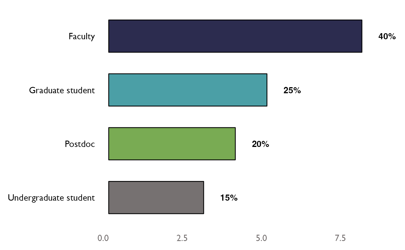
data <- dplyr::tibble(
  role = c(
    "Faculty", "Postdoc", "Undergraduate student", "Graduate student",
    "Graduate student", "Postdoc", "Postdoc", "Faculty",
    "Faculty", "Graduate student", "Graduate student", "Postdoc",
    "Faculty", "Faculty", "Faculty", "Faculty", "Faculty", "Graduate student",
    "Undergraduate student", "Undergraduate student"
  )
)

role_summ <- data %>%
  dplyr::select(role) %>%
  TheMarkUSA::dataSumm()

role_color <- c("#2C2C4F", "#4B9FA6", "#79AB53", "#767171")

horzBarChart(df = role_summ, scale_colors = role_color, width = 0.6)