arrowChart() creates an pre-post arrow chart of group averages and returns
a ggplot object.
Usage
arrowChart(
  df,
  scale_labels,
  group_colors,
  overall_n = FALSE,
  question_labels = NULL,
  question_order = FALSE
)
Arguments
- df
Required, a tibble or data frame of numeric data that also has a categorical group variable to split up the data, e.g. role, gender, education level, etc. must be in 5 point scales and pre-post.
- scale_labels
Required, a character vector of labels for the response scale, must be in the desired order, e.g. if you have a 5 item scale of minimal to extensive it should look like this:
levels_min_ext <- c("Minimal", "Slight", "Moderate", "Good", "Extensive"). This argument accepts a character vector of 3 to 7 items.- group_colors
Required, a character vector of hex codes for colors to associate each group to, e.g. this data has two groups and this function creates an overall group so this function will need a 'group_colors' character vector of three colors. 'group_colors' need to be in the order you want them associated to the group based on the factor levels for the group variable, last color will be the overall group of "all".
- overall_n
Logical, default is FALSE. If TRUE, returns an overall n for all questions that is in the upper left tag of the plot. If False, adds n to each question/item after the respective labels.
- question_labels
Default is NULL. Takes in a named character vector to both supply labels the questions and sort the order of the questions. The named character vector should have the new labels as the "name" and the old labels as the "variable" sorted in the desired order of appearing in the plot, first item will appear at the top of the plot. See examples.
- question_order
Logical, default is FALSE. If TRUE, the question order will be taken from the user supplied named character vector passed to question_labels, where the first item will be at the top of the plot and so on. If FALSE, the question order will be the questions with highest post score average on the top of the plot descending.
Value
A ggplot2 object that plots the items into a arrow bar chart.
Examples
items <- dplyr::tibble(
pre_Organization = c(1, 2, 3, 4, 5, 4, 3, 2, 1),
post_Organization = dplyr::if_else(pre_Organization < 5, pre_Organization + 1, pre_Organization),
pre_Source = c(2, 2, 3, 5, 4, 3, 2, 1, 2),
post_Source = dplyr::if_else(pre_Source < 4, pre_Source + 2, pre_Source),
pre_Publish = c(1, 1, 1, 2, 2, 2, 3, 3, 3),
post_Publish = pre_Publish + 2,
pre_Write = c(2, 2, 2, 3, 3, 3, 4, 4, 4),
post_Write = pre_Write + 1,
pre_Research = c(1, 1, 2, 2, 3, 3, 4, 4, 4),
post_Research = pre_Research + 1,
group = factor(c(
"grad", "undergrad", "grad", "undergrad", "grad",
"undergrad", "undergrad", "grad", "undergrad"
), levels = c("grad", "undergrad"))
)
# Labels for response scales to recode the numeric variables to on the plot:
levels_min_ext <- c("Minimal", "Slight", "Moderate", "Good", "Extensive")
# Question labels as a named vector with the naming structure
# like this: c("{new label}" = "{original variable name}"):
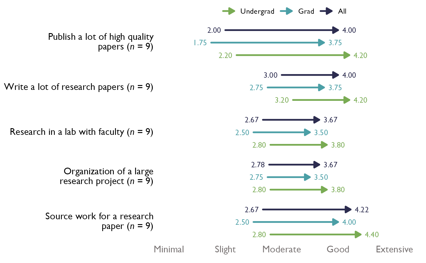
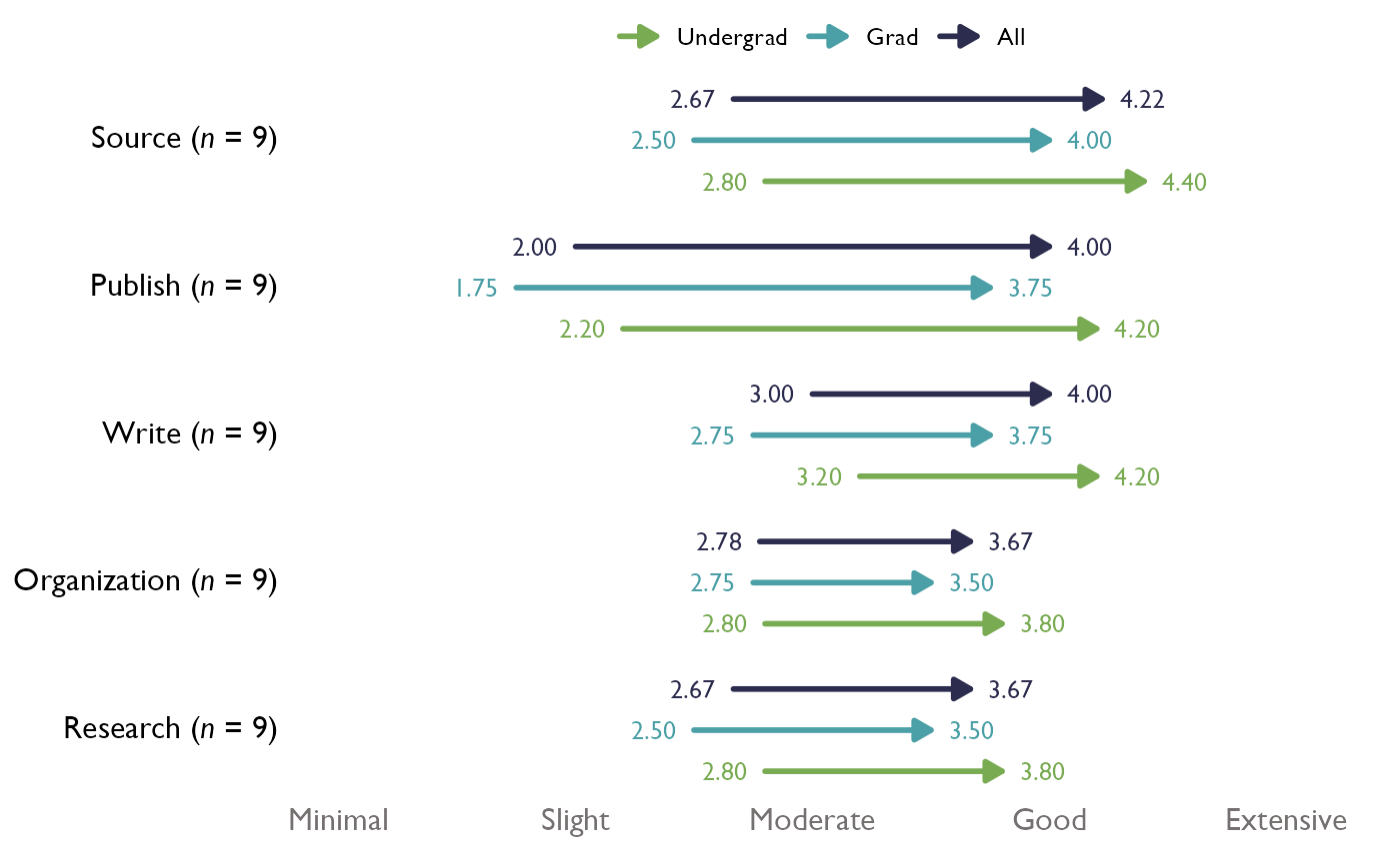
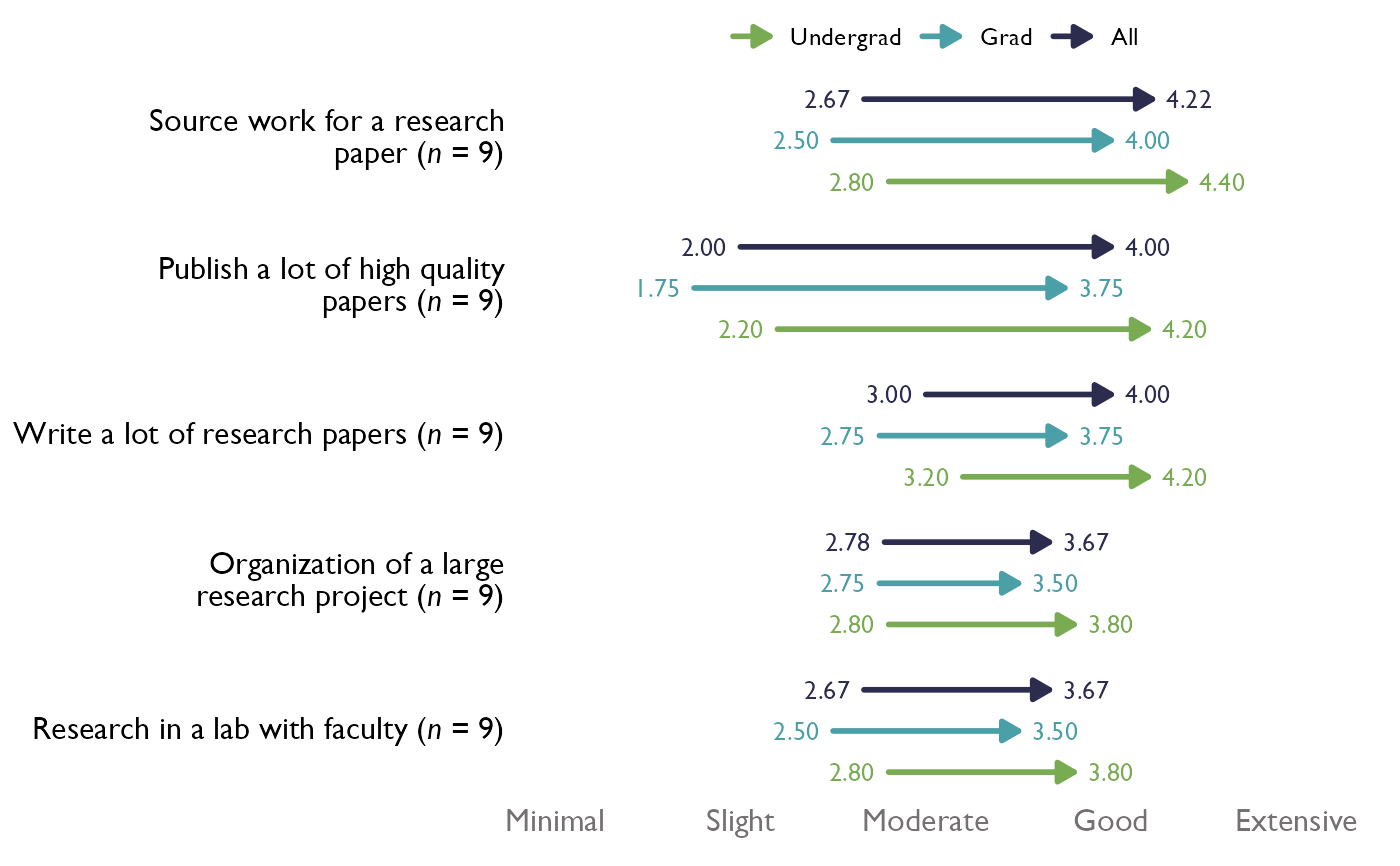
question_labels <- c("Publish a lot of high quality papers" = "Publish",
"Write a lot of research papers" = "Write",
"Research in a lab with faculty" = "Research",
"Organization of a large research project" = "Organization",
"Source work for a research paper" = "Source")
# Set up a character vector of scale colors to pass to the argument group_colors:
threeScale_theMark_colors <- c("#79AB53", "#4B9FA6", "#2C2C4F")
# Example with n for each question and original labels:
arrowChart(df = items, scale_labels = levels_min_ext, group_colors = threeScale_theMark_colors,
overall_n = FALSE, question_labels = NULL, question_order = FALSE)
 # With new labels, question_order = FALSE, and overall_n set to TRUE:
arrowChart(df = items, scale_labels = levels_min_ext, group_colors = threeScale_theMark_colors,
overall_n = FALSE, question_labels = question_labels, question_order = FALSE)
# With new labels, question_order = FALSE, and overall_n set to TRUE:
arrowChart(df = items, scale_labels = levels_min_ext, group_colors = threeScale_theMark_colors,
overall_n = FALSE, question_labels = question_labels, question_order = FALSE)
 # With new labels and order taken from question_labels argument, and overall_n set to FALSE:
arrowChart(df = items, scale_labels = levels_min_ext, group_colors = threeScale_theMark_colors,
overall_n = FALSE, question_labels = question_labels, question_order = TRUE)
# With new labels and order taken from question_labels argument, and overall_n set to FALSE:
arrowChart(df = items, scale_labels = levels_min_ext, group_colors = threeScale_theMark_colors,
overall_n = FALSE, question_labels = question_labels, question_order = TRUE)